Pick a Color: Chartreuse!
February 2022
Needing a random prompt I texted a friend the message “pick a color!” I waited for the reply, but I knew (hoped) she would reply promptly. If nothing came through in 15 minutes I would text another friend. I was working my friend “palette”.
Whatever reply I received my plan was to write about how I use that specific color in my work and what it means to me. Yes, I could have picked one myself, but the colors are all important and I have never been able to answer — “What is your favorite color?” When I was younger my reply was “the rainbow” since I could not pick one. I’ve gone through phases of course — black was the go-to for many years. Green, blue, yellow, grey…they all had their turn.
My friend must have been teaching a class, so I texted another friend for a colorful prompt. There was a quick reply— “Chartreuse!” Really, how did she know? I can easily write about this, because I happen to be making small painting with this color right now! (Note: this may be the favorite color of the first friend I texted, go figure.)
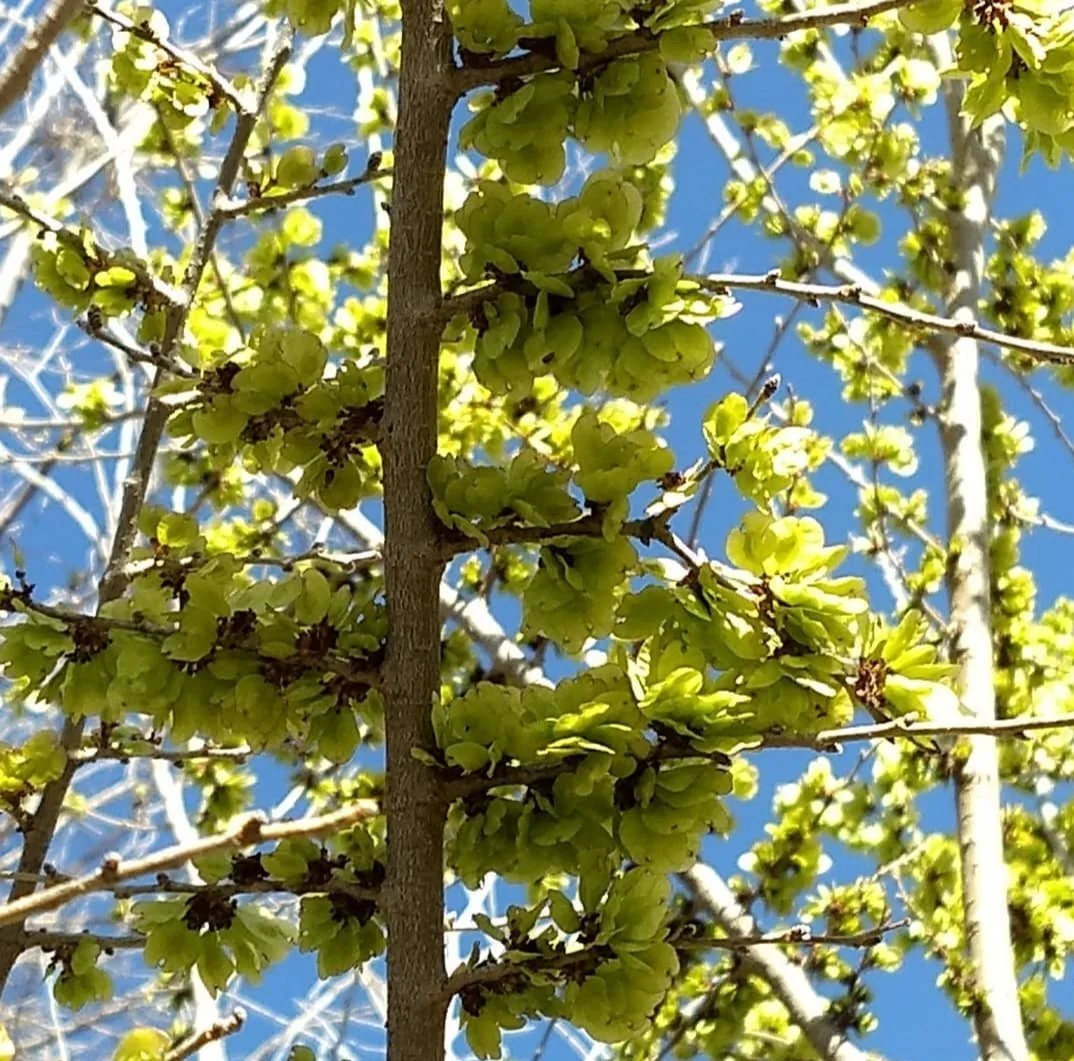
I see this color in nature during hikes all the time: in the leaves, tiny buds, and lichens. These are photos I took in New Mexico over the past few years. It’s bright and catches my attention. It says “Hi. Stop, look at me!”
In these most recent paintings, chartreuse has been a great accent color. It contrasts beautifully with darker colors for the extra pop. In these paintings it works well with the blues and greens. It’s a color that brings a surprise. “Wow! Pow! Kapow!“ It is refreshing, but slaps you in the face a little. It could awaken someone from sleep it it had to.
From top to bottom: “Lighthouse”, “Magma Mountain”, “Pathfinder”, all January 2022
Here are other works where I’ve used this color from the past couple years.
“Neon Night”, 2020
“Peak Advisors”, 2021
“Spring Willow”, 2021


